Zeder Canada
Steel and safety gone digital
What we've done
Mission
Entering a completely new market requires a strong statement. Additionally, if your client operates in the vehicle security industry, the entire image and message need to irradiate reliability and safety - when Zeder Canada contacted us, we defined this as our top priority.
Solution
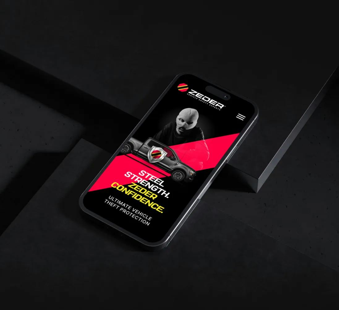
Leaning on the brand's essence and strong symbolism, we provided Zeder Canada with a complete rebranding experience. This included a new logo, fully customized web design and seamless web development with enhanced user experience, with all relevant information presented for future web visitors.
Logo
The existing logo needed to be simplified both in terms of imagery and copywriting, minimizing the amount of text for a more compelling message. Compare the before and after below to see the next step of Zeder's brand evolution.
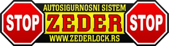


Never forget your roots. We used Zeder's old logo and its traffic sign imagery as the basis of the new logo. Reliability, urgency and impenetrable safety are first communicated through the color palette selection: red, yellow and black take center stage.
Web Design
& Development
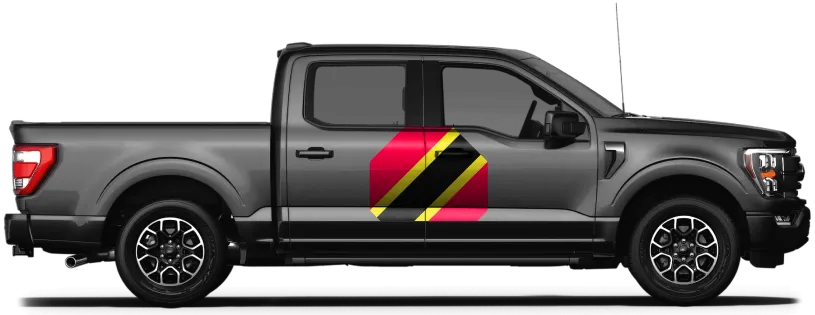
Our web design solution simply followed suit, though red and black dominate the setting. On the other hand, web development allowed our vision to come to life. Zeder's new website is fully optimized for all formats: desktop, mobile and tablet!
ZEDER.CA

Result
Completely new brand identity
Effective message
Striking presence in a large market
Next project
Glasstic
Transparency itself: a promise of safety and practicality voiced by design