Jove
Creating an entire lore behind a product is no easy task - but there is no greater thrill for us!
What we've done
Mission
High-quality truffle products were ready - now they needed a proper identity. This included a logo, an original brand name (with an available domain) and a complete brand book. All of these, however. needed to be tied with a unique story that would set the brand apart from its competitors.
Solution
During our brainstorming sessions, we singled out several traits that the brand needed to embody: premium quality, reliability and an elaborate, convincing back story. That is how Jove came to be with new imagery, product label and website design.

Name/story
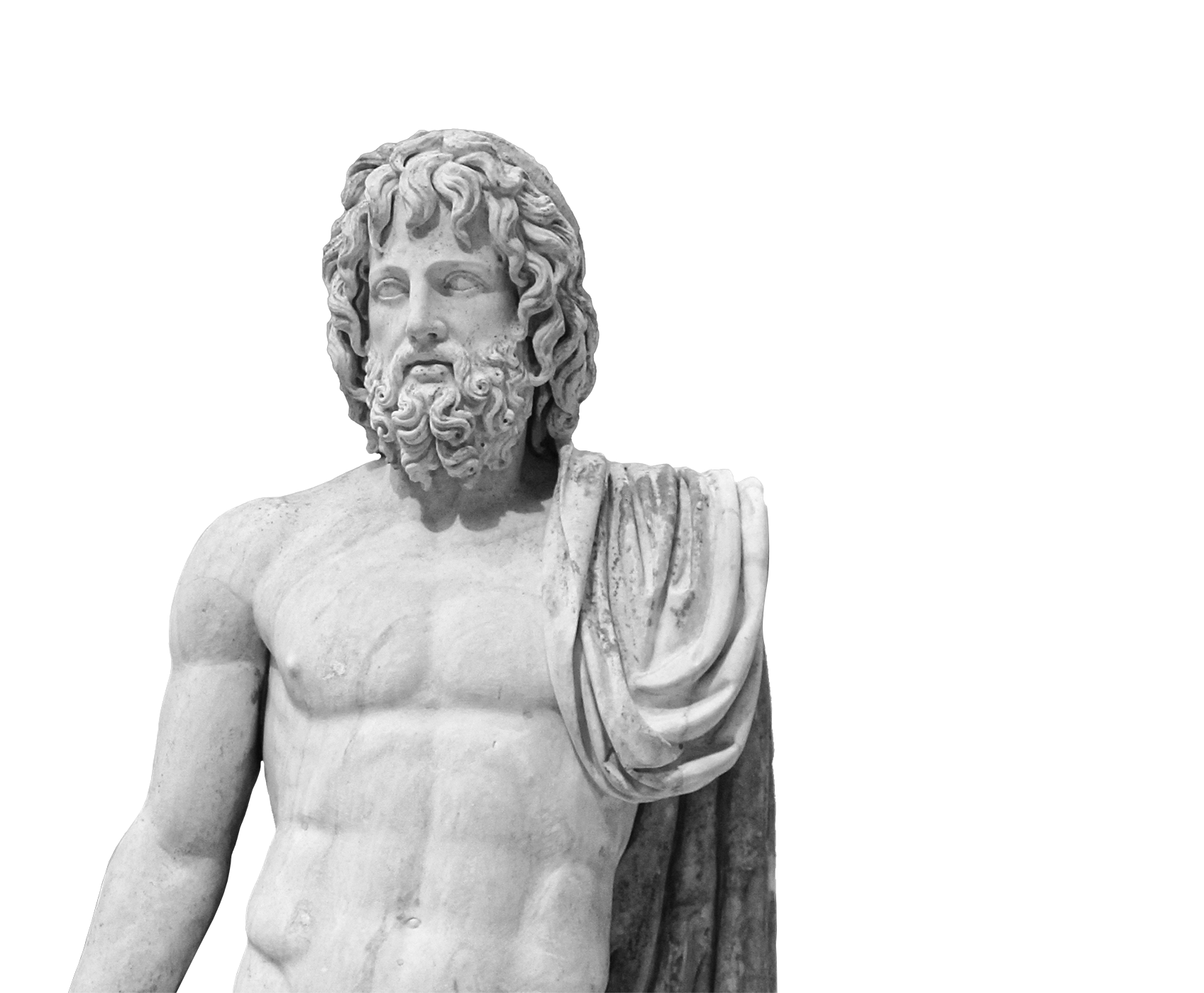
Why Jove then? Dating back to ancient civilizations, truffles are said to have been made by a thunderbolt hurled to earth by the father of the Roman gods - Jupiter himself. The bolt landed right by an oak tree and turned into truffles.
Fun fact: in various sources, Jupiter is also known as Jove. So, we decided with the shorter (and sweeter) name.
Logo
Creating a logo is perhaps one of the most challenging aspects of brand creation due to its associative nature. Essentially, the brand needed to be able to be reduced just to the logo and still remain recognizable. That is why Jove consists of elements of the oak tree in the form of its leaves, together with a discreet bolt symbol in the middle, remaining true to the brand's lore.
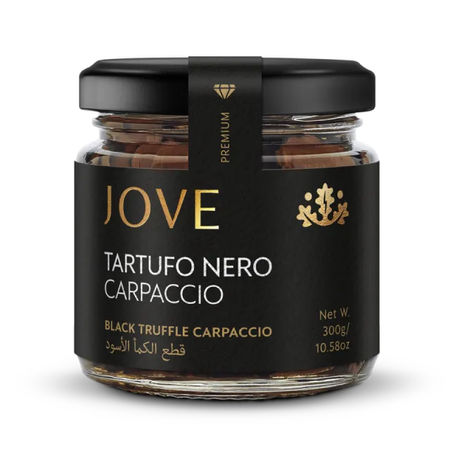
The color palette followed the story through muted, earthy tones, together with a contrasted combination of black and gold used in the product label and as a clear indicator of premium quality.

Web Design & Development
Large sections. Clean layout. Bold HD imagery.
Without any distractions, the brand's essence - truffles - take center stage. The copy focuses on the mythological aspect of the brand, communicating its divine creation as a promise of impeccable quality.
And
finally
Packaging
Premium look. Exceptional products.
Our choice of the label's color palette adds to the luxurious look and feel. Thanks to the elegant dark shade of the label paired with golden lettering, buyers can rest assured that the product inside the packaging is of unparalleled quality.
Result
Packaging that speaks for the product with a sleek and elegant design.
Our forecast: we're looking at a complete hit on the shelves.
Live projectNext project
Glasstic
Transparency itself: a promise of safety and practicality voiced by design