Guarana Joker
Designing the MVP of energy drinks: our ultimate success story.
What we've done
Mission
A well-established brand needed a product that stands out like no other but stays true to their core identity.
Guarana needed monumental package design to mark their iconic collaboration with Nikola Jokic, the Joker. Our main task: emphasise greatness while keeping Guarana's key design elements - the owl.
Solution
Visual association was key and the imagery needed to combine both the old and the new.
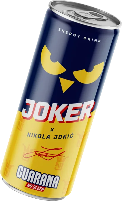
We started with the basics: what makes this colab unique is Nikola Jokić, the NBA superstar, who's known by many as the Joker - this became our heading, while a more subtle touch was a custom logo that was seamlessly blended into the background, only to highlight the MVP's name and original signature on the can itself.
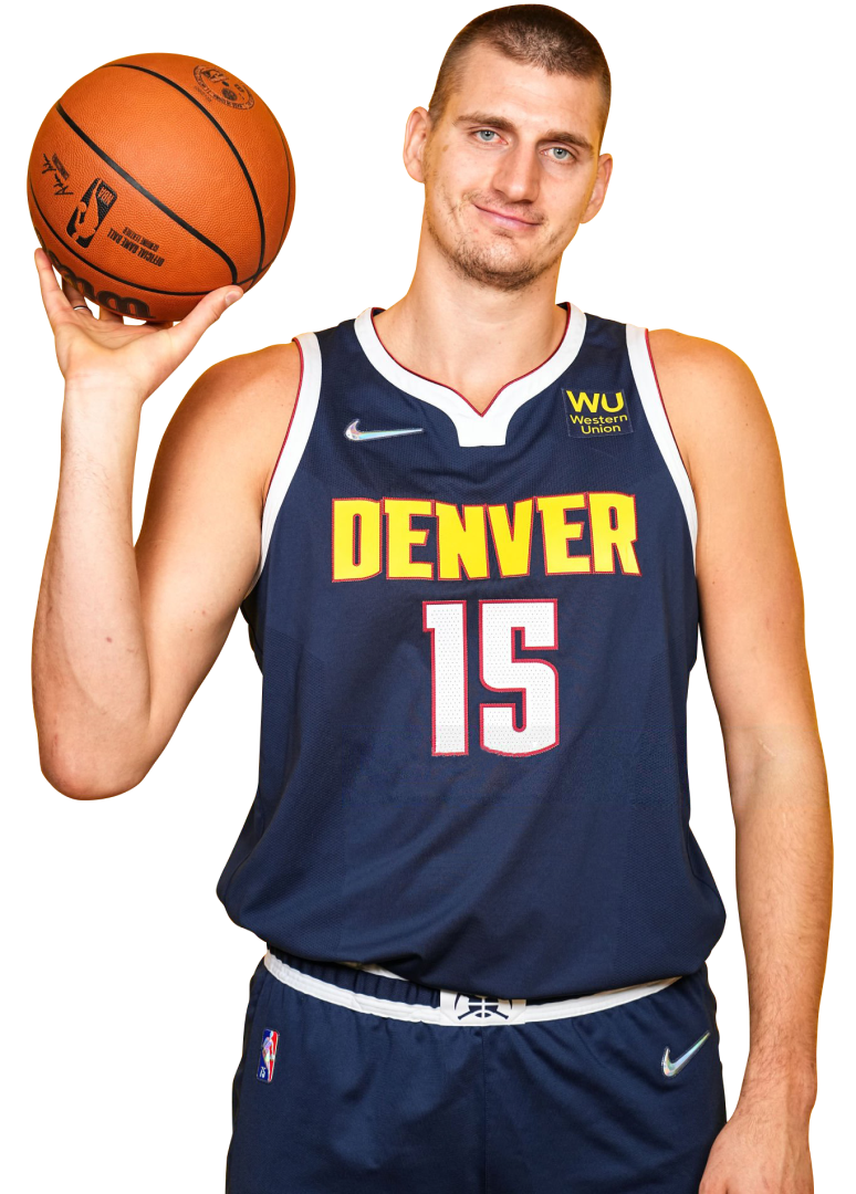
Packaging Design
Guarana is a well-known brand of energy drinks in the Balkans with a wide range of products that each represents a different flavor and different approach. What every energy drink by Guarana has in common is the daring and direct tone of voice that is usually embodied in the product name.
Guarana set a challenge for all willing to participate: come up with an original concept for packaging design that would showcase their newly signed collab with none other than the iconic Nikola Jokic, the Joker. Spoiler: we won the challenge.
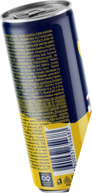

Our vision
Every can purchased becomes your own piece of signed merch! This is why we simply had to include the Joker's original signature and create a bond between the product and the buyer.
Even our palette was carefully combined to flaunt this partnership. Do the first three colors seem familiar? If you recognized the brand colors of Denver Nuggets - Joker's NBA team - you're completely right!


When worlds collide: we made sure to work in line with the brand's existing layout in terms of name/logo positioning, while making sure to include some new elements that made the product pop out the market racks!
A champion deserves his own logo. This is why we created one especially for this purpose and discreetly included it as a patterned background on the can.


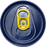
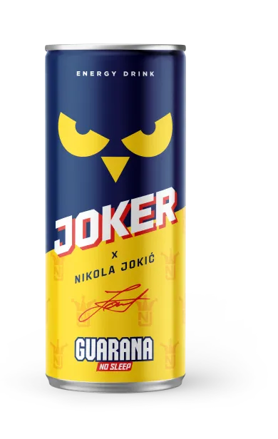
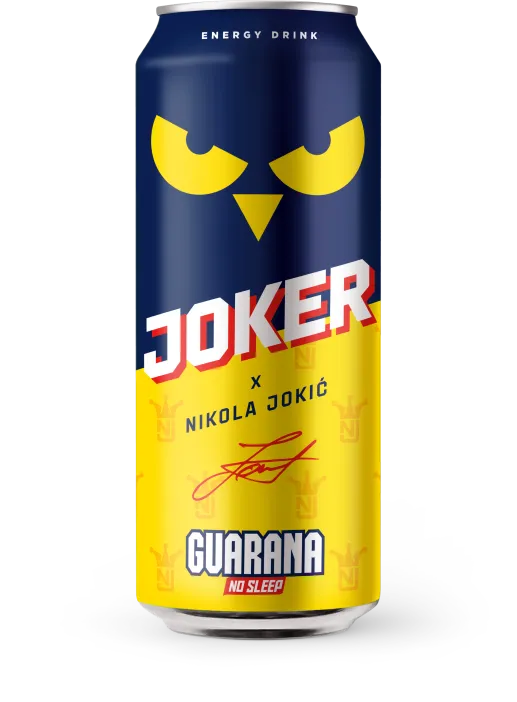
Our winning packaging design comes in two distinct sizes, 0.33l and 0.5l. We adjusted the visuals to match the size and made sure not to overload the smaller can with too many details.
Result
Stunning packaging design for two distinct sizes, 0.33l and 0.5l. We adjusted the visuals to match the size and made sure not to overload the smaller can with too many details.
Cans sold in more than 85.000 stores across 3 different countries.