Imuno shop
How to develop a new brand and a seamless online shop from scratch - the story of Imuno shop.
What we've done
Mission
Our client approached us with an idea as square 1: an online supplement shop that would collaborate with leading supplement brands.
Naturally, we took it from square 1 to Square43. The initial idea consisted of two large tasks. Firstly - developing a completely new brand image that would set the client apart in a saturated market. Next - setting up a fully functional online shop with seamless payment integration.
Solution
We started with 'what' rather then 'who'. In other words, we focused on the brand's mission, which is to make supplements available to all - not a privilege.
This is where we found the inspiration for the brand's motto 'A strong immune system is not a privilege' and we incorporated that philosophy into every single step: design, development and social media channels. We wanted the brand to become a synonym for health, natural ingredients and reliability, backed up by an intuitive, user-friendly shop.
Brand Elements
Logo guidelines

Our color palette was carefully selected to follow the entire concept of natural, high quality supplements, so it combines light greens with darker contrast colors for the logo.
The serif font was selected to provide the feeling of a highend brand that fulfills its promise of impeccable quality to its customers.
Brand colors


Our color palette was carefully selected to follow the entire concept of natural, high quality supplements, so it combines light greens with darker contrast colors for the logo.
Brand Typefaces


The serif font was selected to provide the feeling of a highend brand that fulfills its promise of impeccable quality to its customers.

Web Design & Development
Website colors


Components

Typography

Large sections without any congested paragraphs, only short, to-the-point copy and optimized UX layout - that's how we approached web design for Imuno Shop.
We made sure to keep the website informative without an overwhelming amount of information, keeping in mind that it is also an online shop! E-commerce is our forté, so there were no doubts about the optimal way of setting it up: all products were neatly arranged, filters included, all wrapped with an intuitive shopping process that keeps the customer on track until checkout.
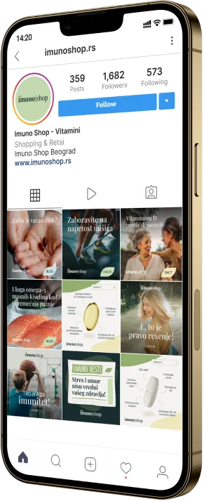
Social Media
Promoting your online shop on various channels is essential for raising brand awareness and generating leads and, eventually, sales.
Custom content, detailed social media plans on a monthly basis, targeted paid campaigns: this is our winning combo. Imuno shop now has a carefully crafted feed that generates visits to their website every day!
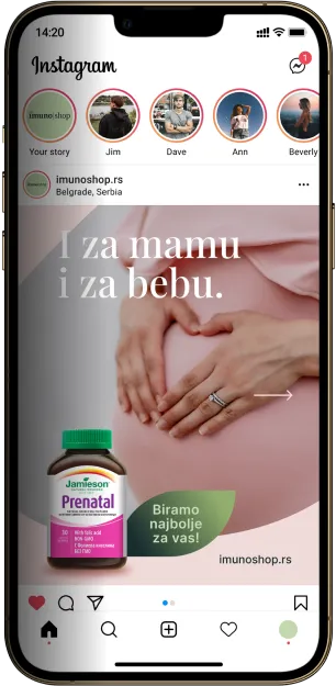
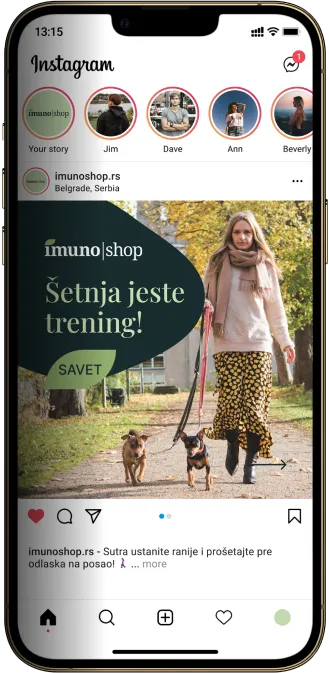
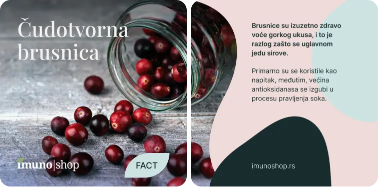
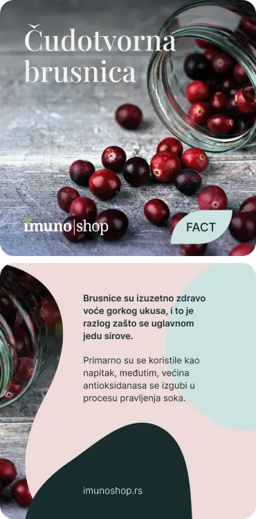
Some behind-the-sheets insight: the key is to vary content in such a way that it remains relevant for your brand - this is why Imuno shop does not post solely product promo.
Our content creators made sure to include helpful health-related tips, quick and healthy recipes, relevant trends and occasional product promo!
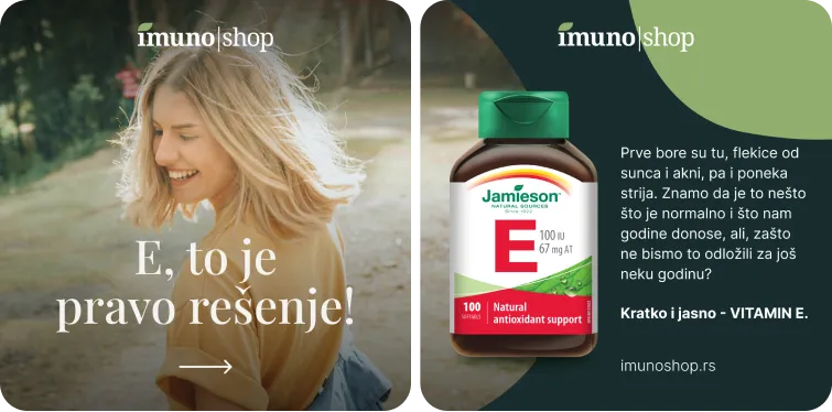
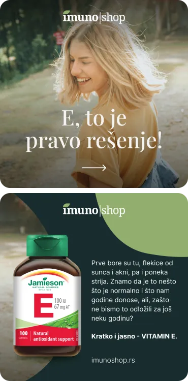
In our creative studio, we like to keep it dynamic. Varied content is important, but so are varied types of visuals.
Though static visuals with clear copy are a safe choice, videos and motion graphics are indisputably becoming more popular. Keeping up with trends is also an important part of our work, so we made sure to include eye-catching animations to make Imuno shop stand out even more!
Promotional motion graphics


Result
Imuno shop has a live online shop and a signed partnership with Jamieson Vitamins and several brand ambassadors.
Regular sales made directly through the website.
Live projectNext project
Glasstic
Transparency itself: a promise of safety and practicality voiced by design