
Events
20 JULY 2026
New Coast, Same Velocity: Rebranding Solana Accelerate for 2026
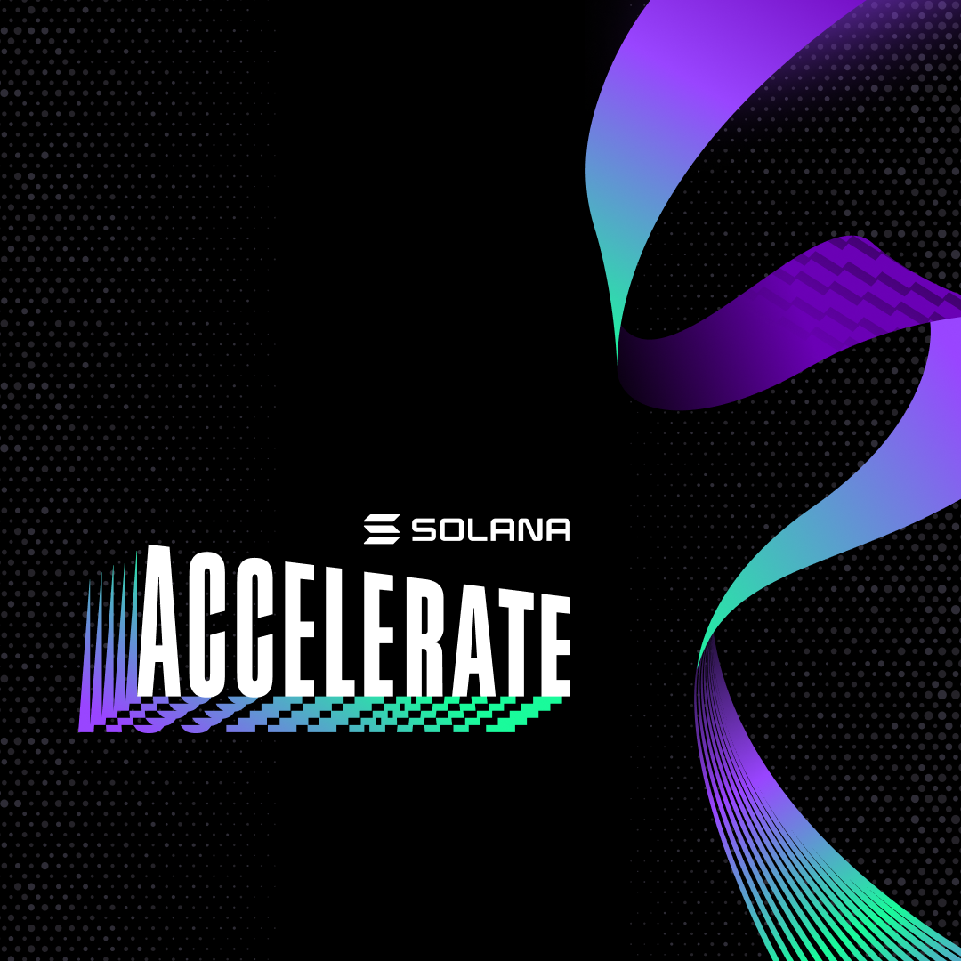
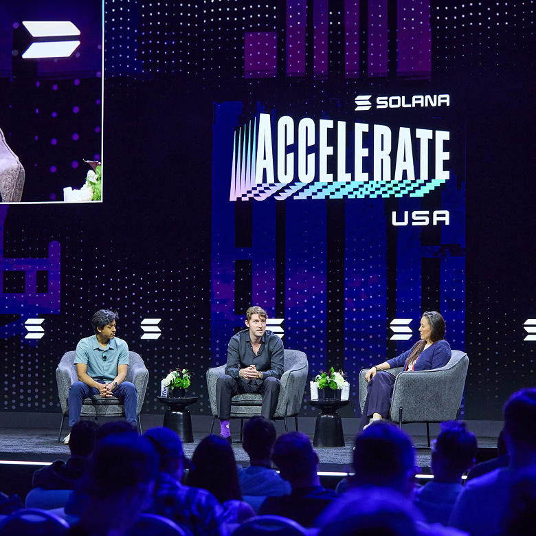
When Solana first came to us with the brief for Accelerate, the ask was simple to say and brutal to execute: build the visual identity for the biggest crypto event in the U.S. in 2025, and make sure the entire industry felt it the second they saw it. In Manhattan, that meant two charged gatherings under one roof, Scale or Die, built around blockchain scalability, and Ship or Die, which pulled leaders from tech, finance and policy into the same room to talk about the future of crypto in America. It was set to be the biggest crypto event the country had seen that year, and the brand had to arrive already at full volume.
The direction Solana handed us was as ambitious as the event itself: American innovation, filtered through a cyberpunk lens. Not a flag pinned to a deck. A flag rebuilt from the inside out, like it had been compiled rather than printed. We took the American flag as raw material, not decoration: saturated reds and blues, sharp geometric lines, pixelated textures, and cascading 3D ribbons that twisted across every surface like the flag had been run through a render engine. The logo carried real weight, the motion graphics (built in Houdini, Cinema 4D and After Effects) carried real speed, and the ribbon running through all of it became the identity's signature, a single moving line holding a flag's worth of meaning and a chip's worth of precision at the same time. It worked because it didn't try to be subtle. Accelerate 2025 needed to announce itself, and it did.
A Brand Built for One City Had to Learn to Travel
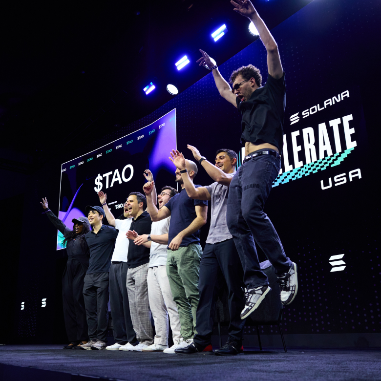
What changed in the year that followed wasn't the quality of that first identity, it was the size of the thing it was representing. Accelerate stopped being a single American debut and started becoming a rolling world tour under one name: Hong Kong hosted the APAC leg alongside Consensus in February 2026, and Miami took the U.S. leg alongside Consensus again in May, pulling in a noticeably heavier crowd than the year before, institutional names like State Street, MoonPay and Google Cloud sitting next to sitting U.S. senators talking digital asset policy. The story was no longer "the loudest new thing in Manhattan." It was infrastructure. It was capital. It was Solana positioning itself as the backbone of what it now calls the Internet Capital Markets, on multiple continents, under the same banner.
A brand built entirely out of American flag DNA doesn't automatically know how to represent a global event family, especially one where the American leg is now just one stop among several. That's the gap the refresh had to close, and it's the real reason this wasn't just a lick of new paint. Accelerate needed a foundation that could travel from Hong Kong to Miami and still feel unmistakably like the same event, with room for each city to keep its own local flavor without the whole system having to be American first and Solana second.
From Borrowed Colors to Its Own
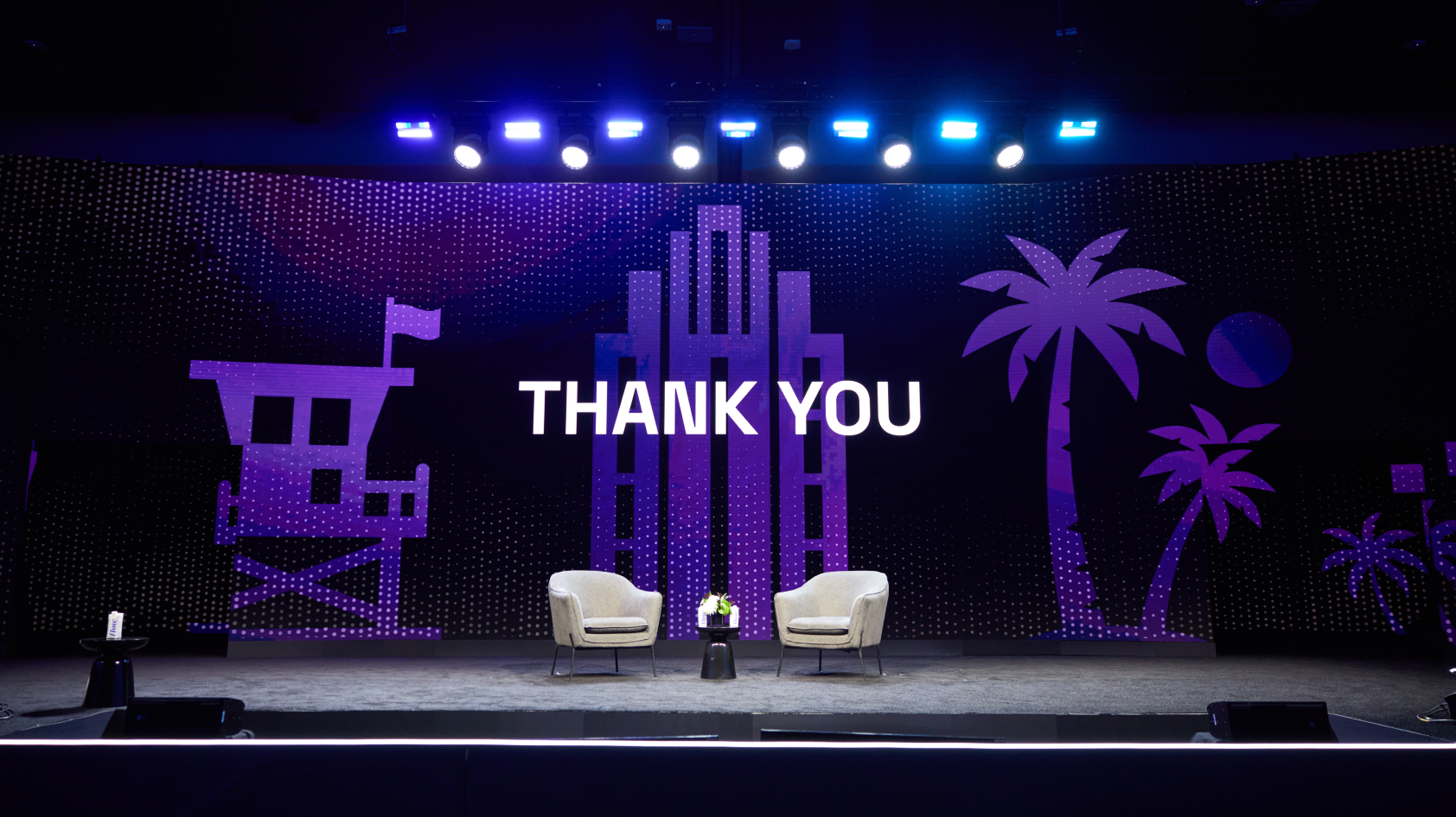
The instinct with a rebrand like this is to start over. We didn't. We kept the ribbon, because the ribbon was never really about the flag, it was about motion, and motion is the one thing Solana never stops selling. What changed was the palette: out went the borrowed red, white and blue, in came Solana's own signature gradient, purple bleeding into teal and green. The identity stopped speaking in America's colors and started speaking in Solana's, which meant it could now sit next to Hong Kong, next to whatever comes next, and still read as one continuous brand rather than a set of one-off national costumes.
That single shift changes the meaning of everything around it. Typography stayed constant, Space Grotesk and ABC Diatype carried over as the throughline connecting both chapters, proof that not everything needed to move for the brand to feel new. The Americana that once carried the whole identity got demoted to supporting cast rather than cut entirely: a Miami skyline silhouette threading through the layouts for the USA leg, a quiet set of American landmarks (the Capitol, the Golden Gate Bridge, Lady Liberty, a bison, the Gateway Arch, a cactus) rendered as background texture instead of the headline act. The flag didn't disappear. It just stopped needing to prove the point on its own.
None of this was a redo out of dissatisfaction with 2025. It's what a good identity is supposed to do when the thing it represents outgrows its first city: move with it, without losing the thread that made it recognizable in the first place. The ribbon that once carried a flag's worth of ambition now carries Solana's own, and it reads just as sharp in Miami as it did in Manhattan, with room to land in whatever city comes next.
We don't design for what an event was. We design for where it's headed next, and Accelerate gave us the rare chance to prove that on the same brand, twice.
DRAG TO SWIPE


