Project
10 APRIL 2023
Meet Glasstic
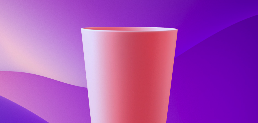
At first, Glasstic had a finished product and a clear (no pun intended) idea of its purpose: glasses made of durable plastic which feels, looks and sounds like it was made of real glass!
How to launch a creative product into the digital stratosphere?
At the time of our first meeting, Glasstic had a finished product and a clear (no pun intended) idea of its purpose: glasses made of durable plastic which feels, looks and sounds like it was made of real glass!
What they were missing was marketing communication in every way possible, especially on socials and their new website-to-be. This included not only a rework of their Social Media presence, but first and foremost, a complete makeover of their existing website. The focus needed to remain on the practicality of plastic glasses that look (and feel) exactly like glass, but we also realized that an extra touch was needed.
This was our starting point: one established brand color, a finished product and an identity to build. Soon enough, we made a to-do list of our own: refurbish the website by adding color; clear out sections on the website for a cleaner look; include to-the-point product description.
With a new set of bright colors and an optimized web layout, we can humbly claim that Glasstic is now nothing short of fantastic!
Firstly, the website needed a splash of color, so we extended the existing palette. Each new vivid shade added a special pop to the page and allowed us to single out the product’s special features more clearly.
Though the product can be marketed both for personal use and venues, the quality for both targets is making the brand vibrant and fun! Be it a party at home or in a club, safety comes first. We just found a way to make it look fun and lively too!
With the basis set, it was time to move on to special touches. We included a seamless glass effect in the design to highlight the product’s unique selling points! We went one step further and made sure to include rounded edges for each text box. Even these details send a clear message: there is nothing sharp or dangerous about these glasses, despite their appearance! The tiniest details like these are also crucial in brand communication!
All social channels needed to follow the website. Design-wise, their latest visuals needed to contain a new color palette, new glass-like imagery with direct, to-the-point copy to promote Glasstic’s refurbished website. Additionally, as our client, Glasstic received a neat monthly Social Media plan. This included the exact posting dynamics, captions and hashtags too! We made sure to vary the types of posts, the underlining message always focusing on the high-quality product.
Not long after, we were met with tangible results: Glasstic’s website visits increased by 25%, with improved user experience and website design that was now fully in line with the brand’s style of communication and, most importantly, the product itself.
Want to know more? Follow us on LinkedIn, Instagram and Facebook!