KLEI WORKS / SERBIA
Journey from artistic philosophy to a fully- developed brand identity.
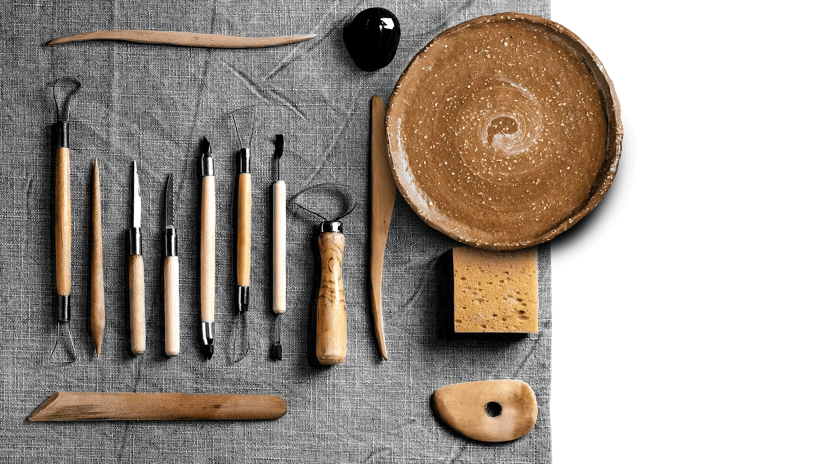
In the present day and age, many art forms have assumed a commercial nature. Founders of what was soon to be named Klei works approached us with a request to help them embody their vision of a pottery brand that would return to the very essence of this artistic craft.
Minimalism. Sophisticated tone of voice. Earthy color-scheme.
These were the pillars of our brand vision. Soon, our studio created an eye-catching brand which clearly focuses on the artistic and timeless value of each pottery product. This simplicity is reflected in the outline of the website, with large and unimpeded sections where the message and visuals take center stage.
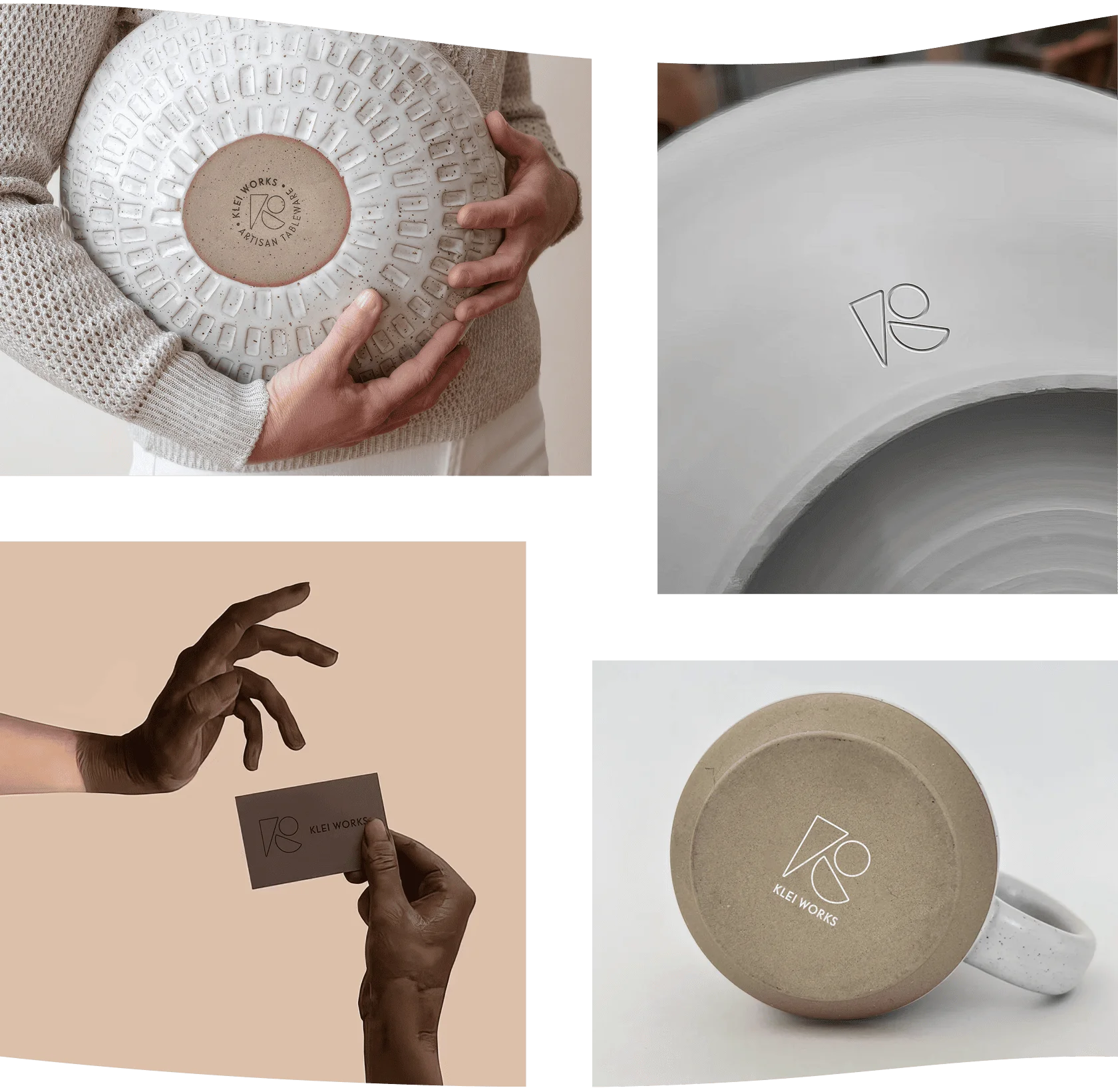
In an optimal scenario, a brand's logo should reflect its essence and, ideally, help users make the right association regarding the brand's services or products. By combining basic geometric shapes, which stand for pottery items, Klei Works has a unique logo which is definitely easily recognizable.

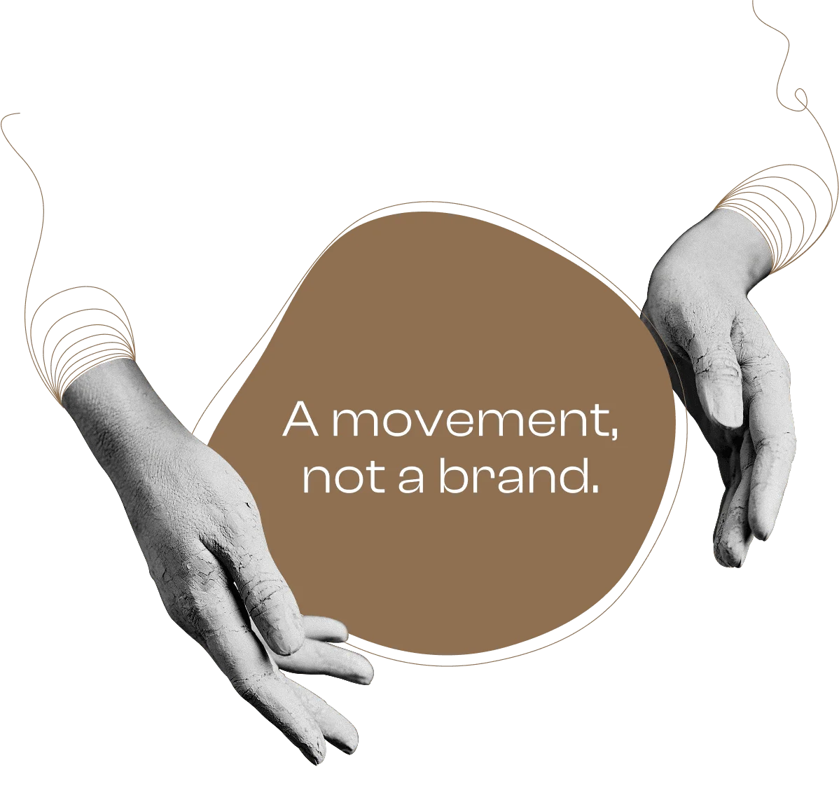
Our logo solution offers a diverse use in branding products as an understated, but effective final touch to already invaluable pottery creations.
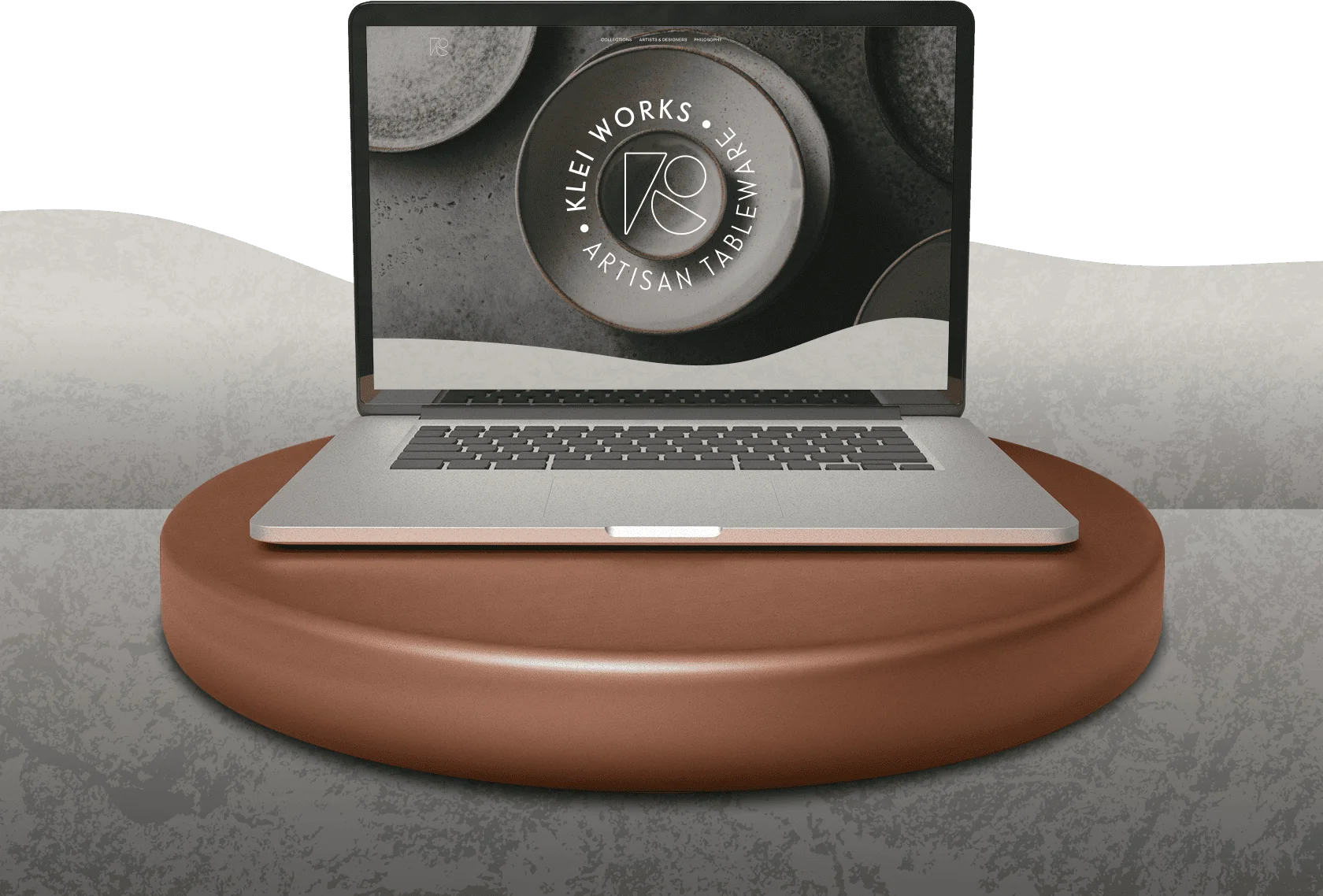
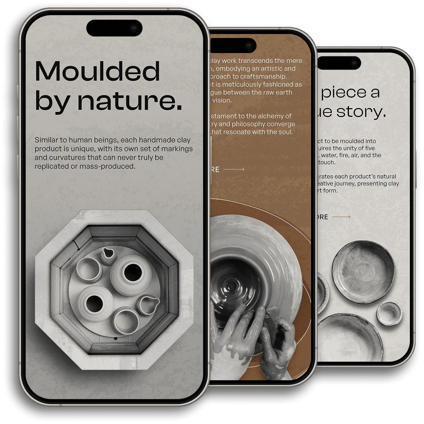
Leveraging cutting-edge design principles and employing a mobile-first strategy, we seamlessly adapted the website's layout, navigation, and functionality to cater to the unique demands of mobile users.
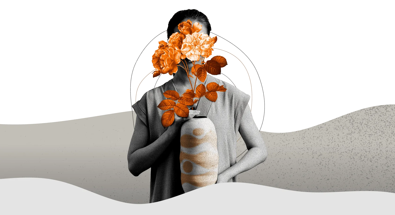
Klei Works is a testament to the alchemy of clay, where artistry and philosophy converge to mold objects that resonate with the soul. circlecirclecircle flower girl
SOUND